Aa
Cocogoose
Bold, rounded, all-caps. Hero titles, section headers, signage. The brand's loudest voice.
Restaurant · Web Design
Overview
Tribe is an all-day dining restaurant in Malta serving three distinct occasions: a relaxed morning breakfast, a fast-turnaround midday lunch, and a considered evening dining experience. As the sole designer on the project, the task was to build a single cohesive web presence that serves each occasion without flattening the differences between them.
The primary success metric was booking conversion: getting visitors browsing the site to complete a booking enquiry. Every structural and visual decision was evaluated against that end point.
3
Dining occasions
1
Sole designer
UX
Navigation focus
Live
Booking-focused CTA
Challenge
The Problem
Tribe's brief was explicit: the restaurant serves three distinct dining occasions but previous attempts at a web presence had either picked one tone and lost the others, or tried to serve all three equally and felt unfocused. The challenge wasn't just navigation. It was brand coherence across three very different moments in a single day. A morning diner and an evening diner are not the same visitor, and the site had to acknowledge that without fracturing into separate identities.
The Solution
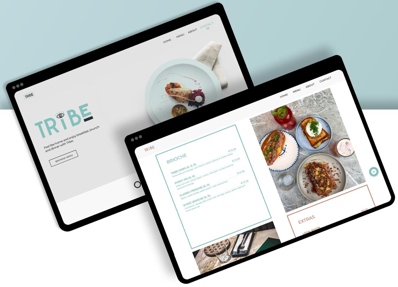
Rather than separating the three occasions into distinct top-level navigation destinations, which testing showed made the restaurant feel like three separate venues, the final design uses a unified navigation structure with occasion signals embedded within each content section. Each section carries its own tone, pacing, and CTA emphasis, while the overall site reads as one coherent brand. The booking path is accessible from every occasion section, removing the friction of a single dedicated contact page.
Constraints
As the sole designer, I owned the full brief, from information architecture to visual design and final handoff. There was no separate UX and UI phase.
The site had to work for morning-casual diners and evening-booking diners simultaneously: no separate microsites, no modal overlays, one coherent information architecture.
The brand palette and tone had to feel specific to Tribe: warm but not rustic, approachable but not low-end. Generic restaurant templates were explicitly off the table.
The primary business goal was converting browsing visitors into booking enquiries. Every design decision was evaluated against that end point.
Process
The work started with a sitemap, not a visual. I mapped three user journeys, morning, midday, and evening, to see where they diverged and where they shared pages. The booking path appeared in all three; the menu structure diverged early. That mapping shaped every navigation decision that followed.
The first exploration separated occasions at the top of the nav. Walking through the journeys exposed the problem: it made Tribe feel like three venues operating under one roof. The final approach unified the navigation and embedded occasion cues (tone, imagery, CTA placement) within each section, so the day flows seamlessly without forcing the user to pick a moment first.
The Concept
Morning
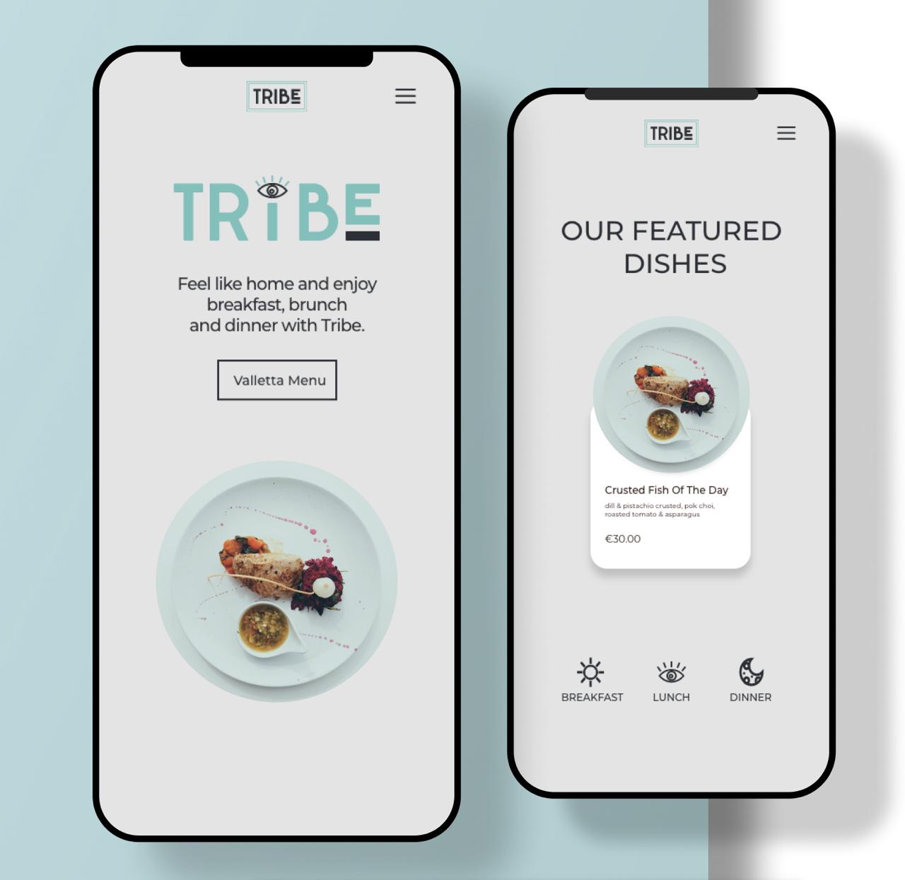
Users arriving in the morning need warmth and comfort: a menu that feels indulgent and worth the trip. The breakfast section leads with visual richness and a relaxed, unhurried tone.
Midday
Lunchtime users often have limited time. The design surfaces quick-decision content, like daily specials and fast options, without requiring users to dig through full menus.
Evening
Dinner is a considered decision. The evening section leans into craftsmanship, seasonal ingredients, and the booking flow, giving users the confidence to commit to a reservation.
Target Audience
Local regulars and weekend visitors seeking a quality breakfast experience. The design prioritises atmosphere and menu legibility over speed, leading with visual richness and a relaxed content hierarchy that suits unhurried browsing.
Office workers and students with limited midday time. For this audience, the design surfaces specials and key options at the top of the section, reducing the number of decisions required before a visitor can commit or move on.
Couples and groups planning a full dining experience. This audience does the most pre-visit research. The evening section is structured to support comparison and consideration, with the booking CTA placed after menu and provenance content rather than at the top.
Design Decisions
Navigation is structured around unified site architecture with occasion signals embedded in content: each section carries distinct tone and CTA emphasis without forcing the user to make an explicit occasion choice at entry.
Rather than a single contact page acting as the conversion endpoint, the booking CTA is embedded within each occasion section. A morning visitor and an evening visitor both reach the same booking path without being funnelled through unrelated content.
Despite serving three distinct occasions, the visual language remains cohesive: warm palette, consistent typography, and a tone that feels specific to Tribe rather than generic hospitality. Brand differentiation comes from content and pacing, not visual fragmentation.
Information hierarchy within each section is calibrated to the decision-making pattern of that audience: quick scanning for lunch, considered reading for dinner. The same menu content is presented differently depending on the expected user intent.
Live on Site
Mobile View
Outcome
Live
Site delivered and live at tribemalta.com, with the booking enquiry path fully functional across all three occasion sections.
2
Revision rounds: extending the site as Tribe grew, adding new locations with their own pages and booking flows while keeping the all-day dining structure intact.
If I were to revisit this project, I'd run a simple 5-second test on the homepage to validate whether the three dining occasions were immediately legible to first-time visitors. I'd also propose tracking bounce rate by occasion-section to understand whether the navigation split was working in practice. The absence of that data means the structural decision was validated by logic rather than behaviour. What I'd leave unchanged: the decision to embed the booking CTA at every occasion level rather than funnelling everything to a contact page. That decision had a clear rationale and the client signed off on the final navigation without revision.
Brand Palette
Sage
#84C3BE · Primary
Terracotta
#C6846D · Primary
Deep Teal
#025669 · Secondary
Dark Brown
#66332B · Secondary
Sienna
#8D4931 · Accent
White
#FFFFFF · Surface
Typography
Three typefaces carry the Tribe identity across menus, signage, and the customer-facing site. Each plays a specific role (display, decorative, and body) chosen so the brand reads warm and confident at any scale.
Bold, rounded, all-caps. Hero titles, section headers, signage. The brand's loudest voice.
Stylised lettering and flourishes, used sparingly for menu headers and standout moments.
Weights 300, 400, 500, 700. Paragraphs, buttons, labels: readable at every size on every surface.