HEX #008080
RGB 0, 128, 128
CMYK 100, 0, 0, 49.8
Overview
Laguna Holidays Malta offers premium property rentals and boat charters on the Maltese coastline. A complete brand and website from a blank brief, built to communicate trust, calm, and the character of Malta rather than a generic holiday template.
The palette is anchored in Mediterranean teal: a direct reference to the sea and more premium than the warm sandy alternatives. The information architecture splits cleanly between the two service lines from the homepage.
2
Services: rental & charter
MT
Malta market
Live
Brand and site delivered
3
Iteration rounds, adding sections and services as the brand grew
Challenge
The Problem
Laguna Holidays Malta offered an excellent, premium service for holiday property rentals and boat charters, but had no brand or digital presence to communicate that quality to potential customers. The gap between the real-world experience and the first digital touchpoint was losing bookings before any conversation had started. The business also needed a single identity to cover two distinct service lines, property and charter, without splitting into two separate brands or creating a confusing homepage.
The Solution
A comprehensive brand identity and website design built around the Mediterranean context: teal as the primary colour anchoring the brand in place, a logo mark combining house and wave to encode both services, and a website information architecture structured around two clear paths from the homepage. The design prioritised clarity of service entry points alongside the premium aesthetic, so visitors arriving for either service could find their way without friction.
Constraints
Laguna operates in the premium Malta holiday market, competing visually with larger travel brands. The brief required luxury positioning without a luxury production budget.
The business offers both property rentals and boat/yacht charters: two distinct audiences with different journeys who arrive at the same homepage. The information architecture had to serve both without confusion.
Malta-specific identity mattered to the client. The design had to feel Mediterranean and specific, not a generic holiday template that could be anywhere in the world.
Worked side-by-side with the agency's lead developer, deeply fluent in both frontend and backend, from kickoff through launch. Design decisions were resolved live in code rather than thrown over the wall, with the build evolving as a continuous conversation.
Process
A competitor audit showed premium Malta sites split between casual script-and-beach-photo brands (low-trust) and corporate white layouts (cold, undifferentiated). The opening was a brand that felt calm, curated, and specifically Maltese. Mediterranean teal beat sandy gold: a sea reference, away from budget-holiday associations. The logo encoded both service lines in a single house-and-wave mark.
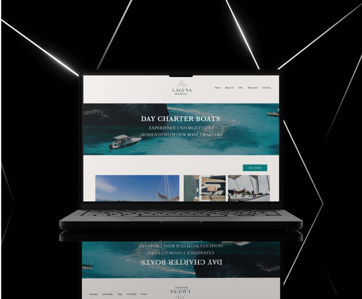
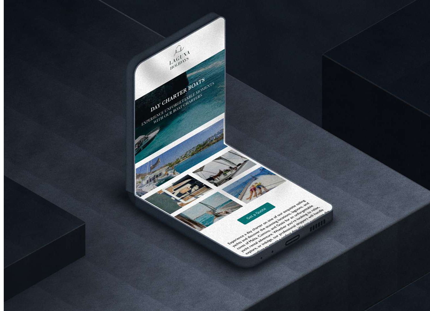
The information architecture splits cleanly into two paths, Properties and Charters, each with its own landing, listing, and enquiry flow. Visitors self-select immediately, mixed listings disappear, and the path to enquiry shortens for both audiences.
Brand Identity
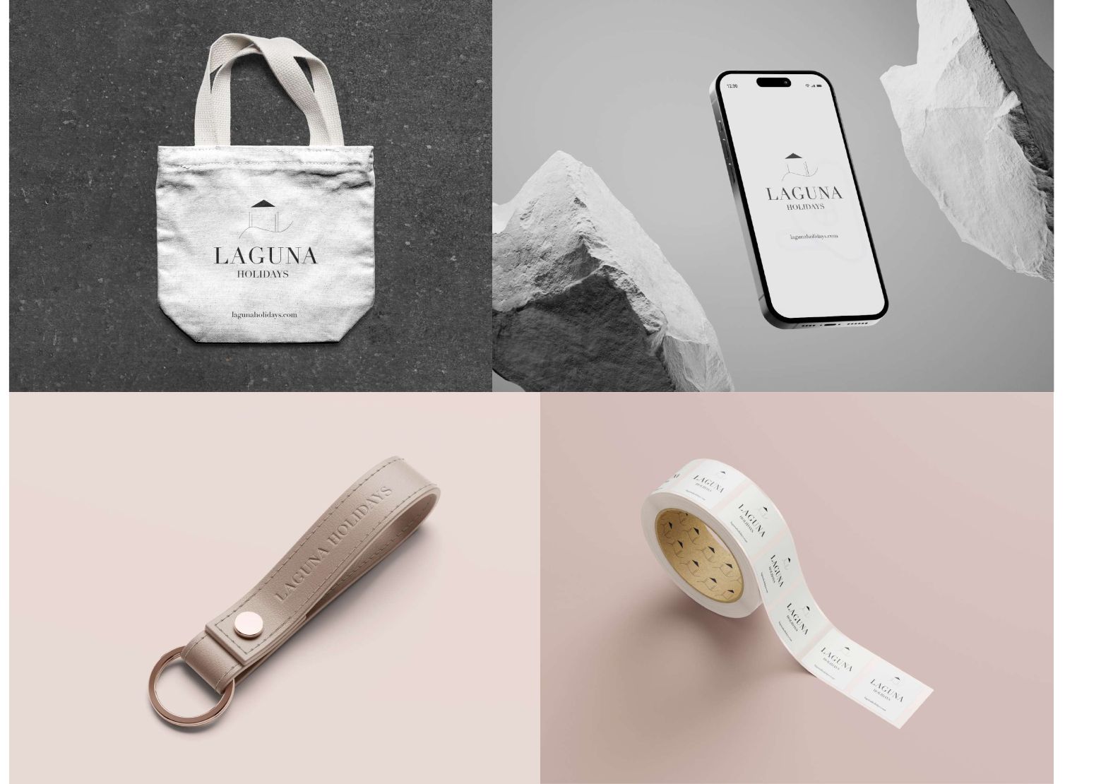
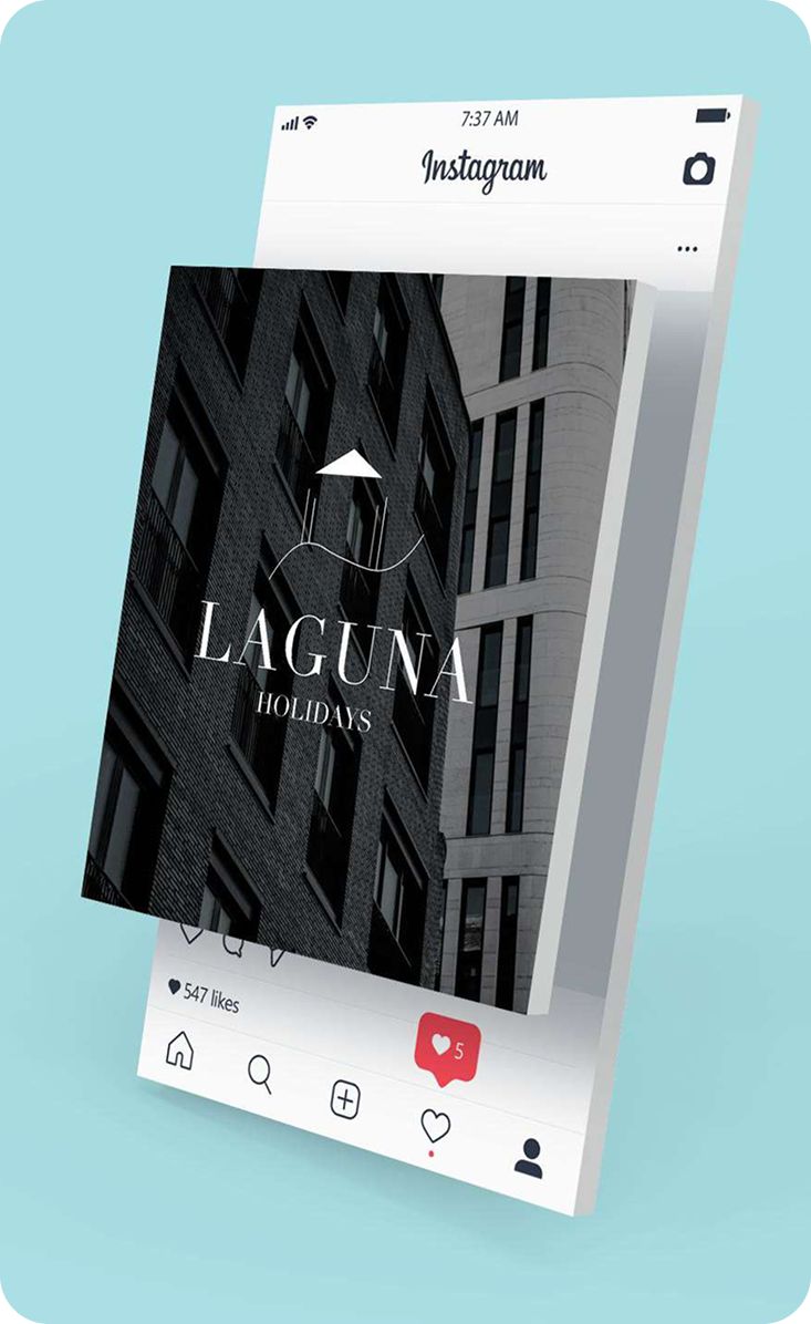
The logo features a property icon with a wave underneath, combining both service lines in a single mark. The geometric form keeps the identity clean and versatile across all brand touchpoints, from web to print to signage.
HEX #008080
RGB 0, 128, 128
CMYK 100, 0, 0, 49.8
HEX #B0E0E6
RGB 176, 224, 230
CMYK 24.48, 2.61, 0, 9.8
HEX #C6AFA8
RGB 198, 175, 168
CMYK 0, 11.6, 15.2, 22.4
Design Decisions
Colour, typography, and imagery choices were grounded in a review of the Malta premium holiday market, identifying what the dominant visual language was and where the gap for a more specific, Mediterranean-rooted identity existed.
The house-and-wave logo encodes both services, rentals and charters, into a single geometric mark. This avoids splitting the brand identity and keeps the logo versatile at all sizes and in all contexts.
Deep teal was chosen over the warm sandy gold alternative because it references the sea directly, the product in both service lines, and reads as more premium within the Malta holiday market context.
The homepage was structured around two immediate entry points, Properties and Charters, allowing visitors to self-select and reducing friction to enquiry. Each service has its own landing section and booking flow.
Outcome
Full brand identity and website handed off to the client and live: logo, colour system, responsive web design, and developer documentation all delivered within the 12-week timeline.