Beauty · Brand & Web Design

Lily & Co. Essentials

Client

Lily & Co. Essentials

Role

UI/UX Designer

Type

Logo + Brand + Web

Sector

Luxury Beauty

Timeline

10-week project

Status

Delivered

View live on lily.mt

Premium brands.
A curator that earns its place.

Lily & Co. Essentials is a luxury beauty retail platform based in Malta — stocking premium brands including Moroccanoil, Marvis, and a curated selection of high-end skincare. The brief was a complete brand identity and e-commerce website from scratch: the business was launching and had no prior visual presence.

I owned every part of this project end-to-end — logo, colour system, typography, the full website design, and the Shopify build itself. From blank canvas to live store, with no external developer.

Luxury positioning

3

Deliverables — logo, brand, web

+

Image editing

Cohesive identity

The Problem

Curating premium brands without being overshadowed by them.

The challenge was positioning. The products Lily & Co. stocked were premium branded goods with their own strong visual identities — Moroccanoil, Marvis's bold colours. The store itself needed a brand strong enough to feel like a credible curator — not a grey-background marketplace — without overpowering the product brands it was selling. The brand had to hold its own in the same frame as the products it carried.

The Solution

A restrained identity that frames products rather than competing with them.

A calm, refined brand built on black, white, and dusty rose — restrained enough to let product photography lead, warm enough to feel considered. The wordmark uses Assistant's clean geometry at a generous weight, with the rose accent carrying brand warmth without competing with the product imagery. Typography and spacing choices throughout the site create the visual breathing room that lets premium products command attention while the Lily & Co. identity provides coherent context.

Constraints

What made this harder.

01

No Prior Brand Equity

Lily & Co. was a new business. There was no existing visual language, no established customer base to reference, and no brand to evolve — everything was built from a blank brief.

02

Competing with Premium Brands in the Same Frame

The site needed to look premium alongside Moroccanoil and Marvis product imagery — brands with strong, distinct visual identities. The store design had to complement, not clash.

03

Sole Designer, Full Scope

Logo, colour system, typography, web design, and image editing — all owned by one person. There was no brand team or art director above me.

04

E-Commerce on Shopify

The website had to live within Shopify's theme constraints — design decisions had to account for what was configurable vs what required custom code, which I implemented directly in the theme as part of the build.

Process

Building credibility from nothing.

I started with positioning, not pixels. Lily & Co. needed to land in a refined middle — premium but approachable — with the restraint to let product photography lead.

Two directions were explored: a darker editorial palette and a warmer, softer one. The darker felt too fashion-forward for a beauty retailer. Final direction: black and white as the structural base, with dusty rose (#E6ADAC) as the single accent. Wordmark in Assistant, weight doing the positioning work.

Design and build ran in parallel — Figma straight into the Shopify theme, custom code where it mattered, configurable sections where it didn't. Product photography colour-graded into a consistent warm tone before launch.

Brand Identity

Elegance in every mark.
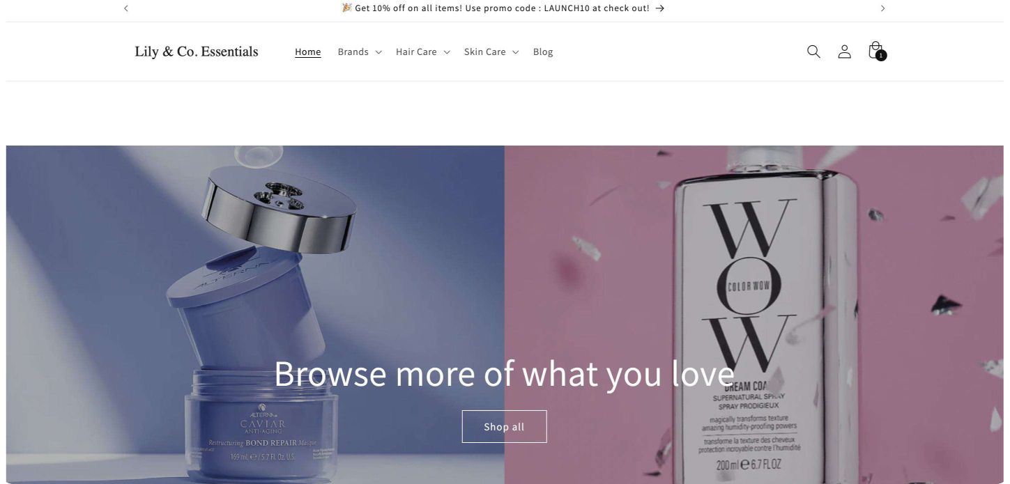
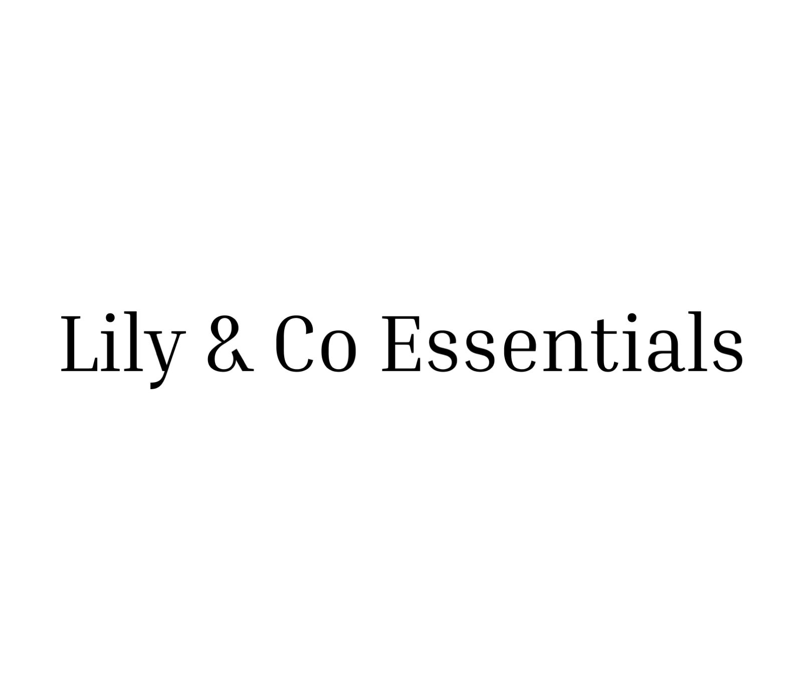
The wordmark is set in Assistant — a clean geometric sans that reads as premium without over-designing. Weight and letter-spacing do the positioning work, considered enough to stand beside Moroccanoil and Marvis, restrained enough not to overpower them. Delivered in black, reversed white, and with the rose accent as a secondary mark.

Lily & Co. Essentials wordmark — primary lockup on rose.
Lily & Co. Essentials wordmark — black lockup on white.

Black

#000000 · Primary

Dusty Rose

#E6ADAC · Accent

White

#FFFFFF · Background

Lily & Co. Essentials — Shopify website desktop view.
Lily & Co. Essentials — Shopify mobile homepage view.
Mobile — Homepage
Lily & Co. Essentials — Shopify mobile products page view.
Mobile — Products

What Was Delivered

End-to-end brand work.

01

Logo Design

A geometric lily mark paired with a considered wordmark — distinctive and versatile across packaging, web, and social. Delivered in full colour, reversed, and single-colour variants.

02

Website Design

A fully designed Shopify site — homepage, product listing pages, and product detail pages — with a visual language built to let premium product photography lead. Built on Shopify so the owner has full control: adding products, editing content, running promotions, and updating the site without needing a developer.

03

Image Editing

Product photography colour-graded to sit within the brand's warm tonal range — ensuring a consistent, polished presentation that reinforces the premium context throughout the site.

Design Decisions

Built for the luxury market.

01

Black Base, Rose Accent

Black and white as the structural foundation — credible and clean enough to hold alongside premium product brands. Dusty rose as the single accent: warm, feminine, and distinct without competing with product photography.

02

Product-Led Image Treatment

Product images were colour-graded to a consistent warm tone before going live — not to impose the brand on the product, but to stop conflicting colour temperatures from breaking the page's visual coherence.

03

Generous White Space

Padding and spacing choices throughout the site were deliberate — enough breathing room to feel premium, tight enough to stay navigable. White space does the positioning work that a new brand can't yet do through recognition alone.

04

Shopify-Aware Layout Decisions

Layout choices accounted for Shopify's theme architecture — sections that needed custom code I built directly into the theme, while configurable sections were left accessible so the owner can tweak content and promotions independently post-launch.

Outcome

Brand approved, site live.

Live

Site launched at lily.mt — full Shopify e-commerce store live with brand identity applied end-to-end

2

Revision rounds — expanding the store beyond the initial scope with a dedicated Men's section and a full skincare range as the brand grew its catalogue.

The metric I would want tracked post-launch is brand recall — specifically whether customers associate the Lily & Co. name with quality before seeing product prices. Given that user research wasn't possible pre-launch, I would also want to run a first-click test on the homepage to confirm that the primary call to action (shop by category versus featured product) is immediately legible to a new visitor.

What I would do differently: involve the client earlier in the positioning exercise rather than presenting a finished direction. The first round could have moved faster with their input on competitor references — which would have either confirmed the chosen direction sooner or surfaced a misalignment before it cost revision time.

"I'm so happy with how the website turned out. Jessica really understood my vision — not just what I asked for, but what the brand needed to feel like. Since launching, my existing customers have been buying more easily than ever, and I've had multiple people tell me it's one of the best e-commerce sites for hair products in Malta. The navigation is intuitive, products are easy to find, and the whole experience feels premium — exactly what I wanted for Lily & Co."

Owner — Lily & Co. Essentials

Next Project

European Ball Pool

View Case Study