Overview
European Ball Pool had grown as a competitive sport but its digital presence hadn't kept pace. The federation needed a site that represented the sport credibly, served members across a wide range of technical confidence, and could be maintained by the federation team without ongoing developer involvement.
Six-week project: I owned the website, a graphic designer ran the new brand identity in parallel. Clear navigation, brand coherence, and CMS independence shaped every decision. Active users grew +40% in the three months post-launch, and the federation took ownership of content updates from day one.
+40%
Active users post-launch
2
Collaborators: brand + web
CMS
Self-edit: federation manages updates independently
Live
Site launched and in active use at euro8ball.com
Challenge
The Problem
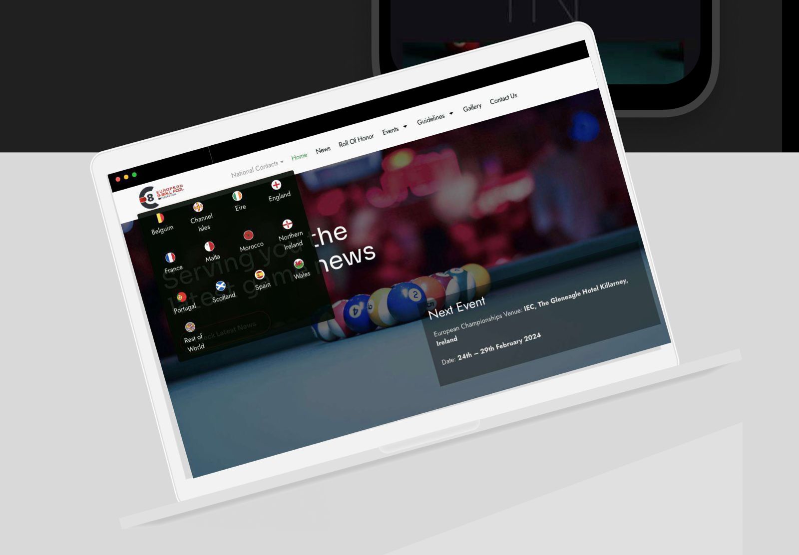
Member feedback and navigation data both pointed to the same problem: users were struggling to find the content they came for. Event listings, results, and joining information were buried or unclear, causing members to reach out directly rather than self-serve. The visual design had also fallen well behind the federation's ambitions; the existing site did not communicate the seriousness of the sport to new visitors. A new brand system had been commissioned, but there was no digital home to receive it.
The Solution
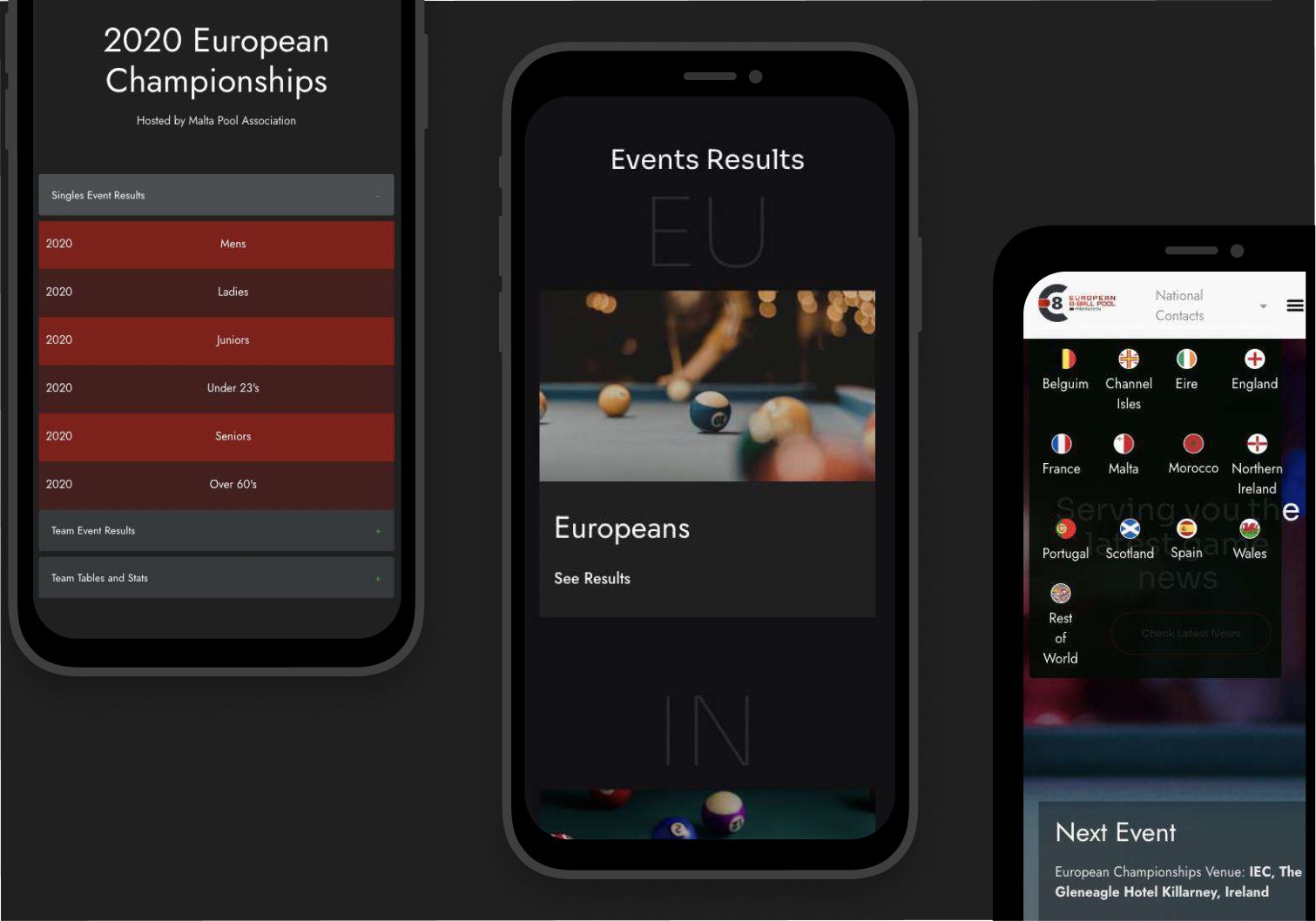
I designed a website structured around four core user journeys: finding events, checking results, joining the federation, and reading news. The audience spans young members to long-standing older members, so accessibility had to cover the full age and ability range: no hidden patterns, no assumed familiarity with web conventions, straightforward labelling, predictable layout, and visible calls to action throughout. Built on WordPress so the federation team can manage events, results, and news independently without technical support.
Collaboration
The project was split deliberately between brand and web, each discipline handled by the right specialist, with close communication to ensure the outputs aligned.
Collaborator
Responsible for the full new brand identity: logo, colour system, typography, and visual language. Delivered brand guidelines that became the foundation for the website design.
My Role
Responsible for translating the new brand into a fully designed website: information architecture, navigation, page layouts, UI components, and final design handoff. Aligned every decision with the new Ball Pool brand colours and visual identity.
Constraints
The federation needed to manage and update the site independently (events, results, images, news) without relying on a developer. WordPress with a customisable CMS was specified as a hard requirement from day one.
The brand system arrived as a defined deliverable: colour, type, and visual choices were set. I worked closely with the graphic designer to honour those decisions faithfully in a digital context, and side-by-side with the lead developer through implementation, so design intent was preserved all the way to live code.
The user base spans from tech-savvy younger members to long-standing older members with minimal web experience. No clever UI, no hidden patterns. Every interaction had to be legible and predictable for the full range of users.
The brief covered the public-facing website, not the wider digital presence, social channels, or any member portal functionality. Decisions about what the site should and should not do were made with that boundary clearly in mind.
Process
I started with a thorough review of the brand guidelines, understanding the colour, type, and visual system before touching layouts. From there, I mapped the four key user journeys (events, results, joining, news) into the information architecture. My first navigation was too complex: sub-categories that mirrored how the federation organised itself, not how members would actually look for something. After testing against the accessibility brief, I simplified hard: fewer top-level items, clearer labels, no hover-dependent menus.
WordPress with a configurable page builder was chosen early: a CMS the federation team could learn quickly and own without technical support. Every layout decision factored in the edits they'd actually need to make (events added, images swapped, results updated) so the site stays intact under daily content changes.
Brand System
The Euro 8 Ball brand pairs a dark charcoal base with a bold red primary, communicating competition and energy without decorative flair. Green handles interactive UI states, while near-white surfaces the navigation for contrast and legibility. Jost, a geometric sans-serif, carries all typography.
Background
#202020
Dark Charcoal
Primary
#F20406
Brand Red
UI Accent
#079846
Sport Green
Body Text
#E6E6E6
Light Grey
Nav / Surface
#F9F9F9
Near White
Typography
Jost, a Geometric Sans-Serif
Primary typeface across all headings, navigation, and UI elements. Clean construction with strong legibility at both display and body sizes.
Design Decisions
With a user base spanning widely varying levels of web experience, navigation was simplified from an early multi-level draft down to a flat, clearly labelled structure. No jargon, no hidden menus, no hover-dependent sub-categories, just visible, predictable paths to the content members came for.
Every colour, typeface, and component was chosen to reinforce the new branding, ensuring the website and the broader brand identity felt like a single, coherent whole. Working from a fixed brand brief meant fidelity was the standard, not interpretation.
The redesign moved away from the dated aesthetic of the previous site: contemporary layout patterns, purposeful whitespace, and confident typography gave the sport a digital presence that matched its competitive standing.
Content was structured around what members actually need: event listings, results, club information, and joining guidance, surfaced clearly at the top level rather than buried in submenus or requiring prior knowledge of the federation's internal organisation.
Outcome
Active users increased by 40% in the three months following launch, measured against the prior period average. The metric came from the federation's own analytics (not a tool I configured, but one already in place), which makes it a clean baseline comparison. The feedback from the Ball Pool community was consistently positive, with members noting the ease of finding events and results.
The federation team took ownership of content updates from day one of handoff, managing events, results, and news independently without developer involvement.
+40%
Increase in active users in the first three months post-launch, against the prior period average
+ve
Overwhelmingly positive feedback from the Ball Pool community, particularly around findability of events and results
CMS
CMS Adopted: federation team managing updates independently without developer involvement post-handoff
Reflection
The navigation structure was validated through usability testing with real members and pressure testing before launch, which is what gave me confidence to simplify the earlier multi-level draft rather than just assume it was right. The site's role is to communicate clearly (announcements, upcoming events, results, federation info), not to handle transactions. If I were approaching it again, I'd push earlier for richer event detail pages and a season calendar view so members can scan the full year at a glance: natural extensions for an announcement-led site members return to throughout the season.