The Solution
A three-state interaction that turns browsing into deciding
The feature works in three moments: a persistent CTA on the page, a spinning wheel animation, and a final reveal. Each state is designed to build anticipation and reduce friction to the click-through.

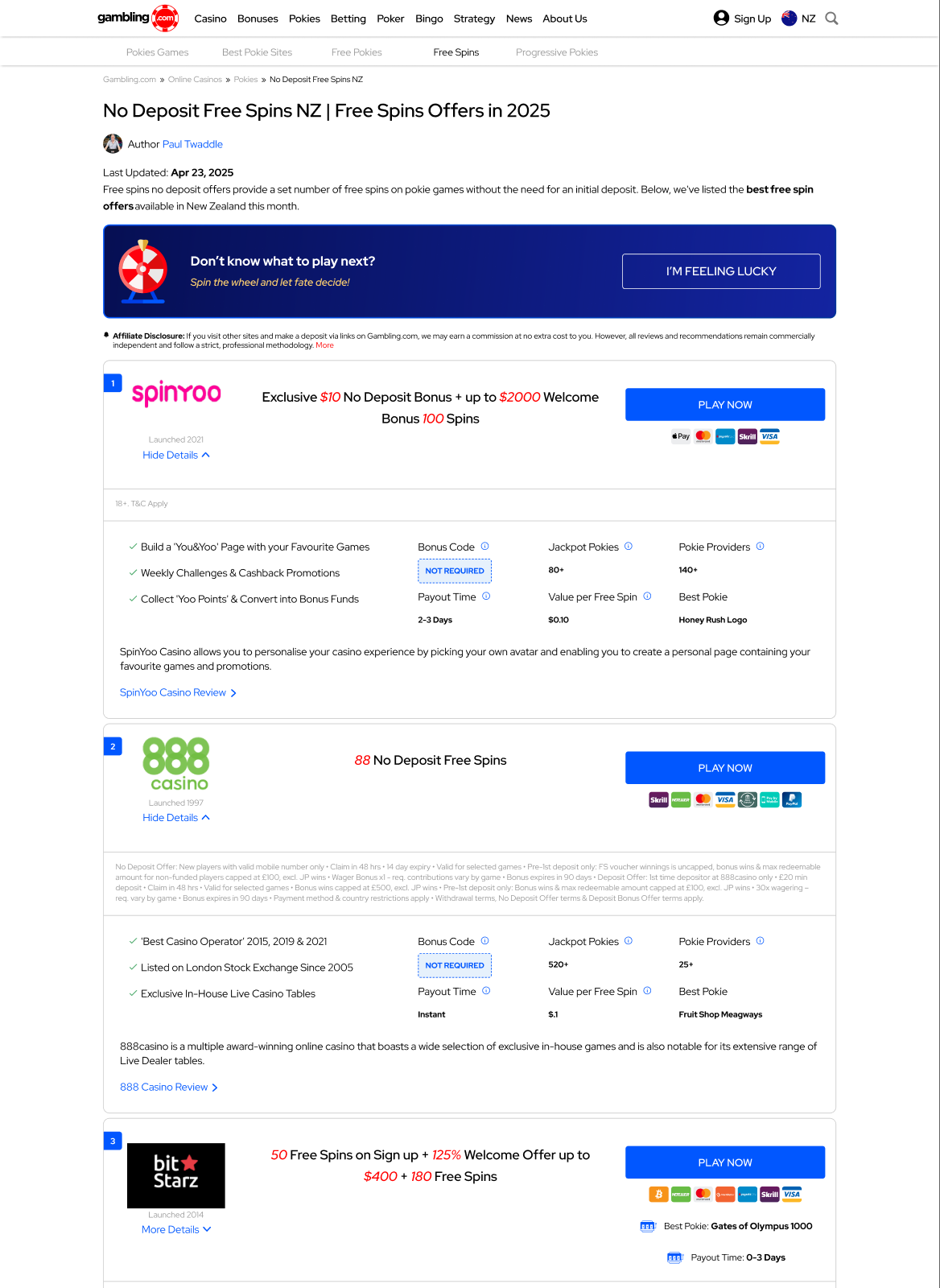
State 01
The Invitation
A persistent banner above the oplist with a wheel icon, a curiosity-driven headline, and a single bold CTA. Designed to interrupt the passive scroll without being intrusive.
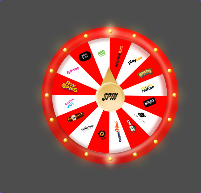
State 02
The Spin
Clicking triggers a full-screen modal with a spin wheel cycling through operator logos. The animation builds anticipation, slowing before landing on the winner.

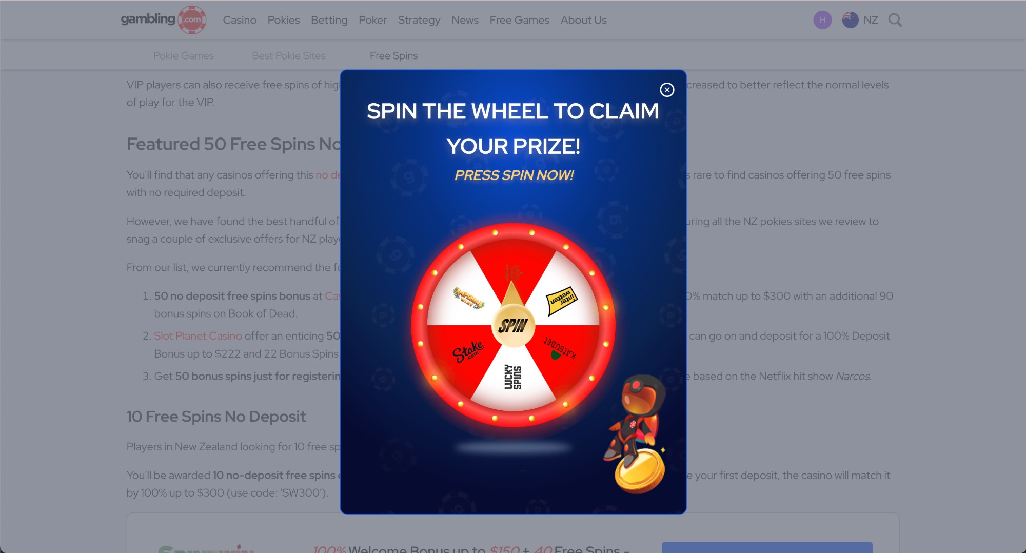
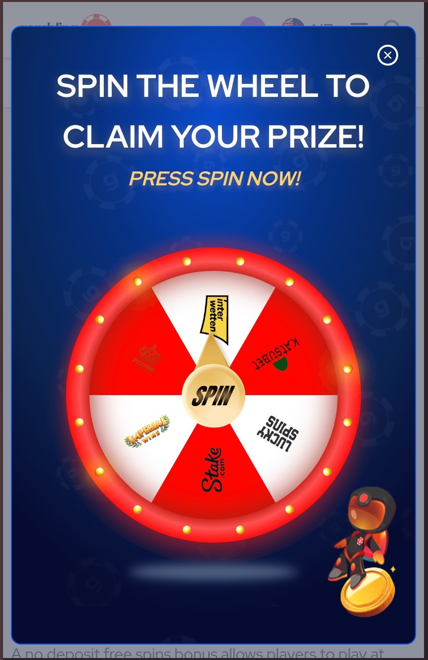
State 03
The Reveal
The popup resolves on a single operator from the top 30, showing the brand, offer, and a prominent CTA. One clear action, no competing choices.